
Forecasting Methods
Forecasting Maximum and Minimum Temperatures for Tomorrow
Download Instructions- Visit the National Weather Service's MOS Text Bulletins
- Go to Bulletin Builder...Select "latest"
- Under Operational Products, GFS MOS, check Extended (MEX)
- Next, under Select Stations to View, chose Select by List
- When you select this option a list of U.S. States appear below. Select a state. I'll pick N.Y.
- When you select a state (ny) a list of cities in N.Y. appear.
- Select one or many. I CHECKED ALBANY (ALB) & POUGHKEEPSIE (POU)
- Go to the bottom of the list and click on GO TO SUBMIT.
- That brings you to the top where you started. Click VIEW BULLETINS
- The two cities I selected in N.Y. Will appear where it says selected stations.
- To decode the message visit The Meteorological Development Laboratory
- Select MEX Card, a sample message and decoding is given
Here is the secret. Write down the Maximum and Minimum temperatures forecast and compare the actual Maximum and Minimum temperatures you record at your location. You may have to add or subtract a few degrees. Have the youngsters study this. After a short time, they will know how much to add or subtract. Also, see if it works the same on a cloudy night, or during a windy day or if the ground is covered with snow. Don’t give the youngsters the answers let them find out by trial and error. That is the fun. Some sharp youngsters will learn right away. Let them help the other youngsters. One only really knows something when one can actually teach it.
Forecast Temperatures for Every Hour of the Day
Download InstructionsVisit NOAA's National Weather Service Meteorological Development Lab and choose the state you wish to forecast the hourly temperature.
To decode the information, visit NOAA's National Weather Service Description of the GFS LAMP Alphanumeric Message.
At the left is a column…second line down is UTC (Universal Time). A complete time chart is available to all for all time zones in the United States. Use it.
The second line is TMP. This is the temperature in degrees Fahrenheit for each hour. This lists the forecasted temperature for each hour for the next 24 hours. Pretty simple. See how close the forecasts are to the actual readings at your location.
Again study the result and make adjustments for each hour of the day. Great for planning recess!
Forecasting Precipitation Amounts (How Much Rain or Snow)
Download Instructions- Visit the Weather Prediction Center
- Click on day one: (Click on “Contours only”). The large map indicates how much precipitation will accumulate in the next 24 hours. See the solid colored lines. All areas in the solid yellow-brown line will receive at least .01 of an inch of precipitation will fall during the next 24 hours.
- This page indicates how much precipitation (rain or snow) will fall in a 24 hour period over a given area.
- All areas within the red line indicate at least .25 inches of precipitation will fall the next 24 hours.
- All areas within the green line indicate at least .50 inches of precipitation will fall during the next 24 hours.
- All areas within the blue line indicate at least 1.00 inch of precipitation will fall during the next 24 hours.
- All areas within the dark brown line indicate at least 1.50 inches of precipitation will fall during the next 24 hours.
- Now click on day 2: (Click on “Contours only)”. This maps indicates how much precipitation will fall from 24 hours to 48 hours. (Use same rules as day one).
- Now click on day 3: (Click on “Contours Only)”. This maps indicates how much precipitation will fall from 48-72 hours. (Use same rules as day one).
- Click on days 4 & 5. (Click on “Contours only)”. This gives the total precipitation that will fall during days four and five.
To determine how much snow will accumulate use the general rule that one inch of liquid (rain) equals ten inches of accumulated snow.
However, if the air is very cold, the snow will be dry & fluffy and one inch of rain could accumulate to 30 inches of powdery snow. If the temperature is mild (between 33 and 36 degrees Fahrenheit, one inch of rain could accumulate to only about one to two inches of very wet, slushy snow.
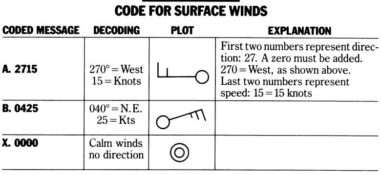
Forecast Wind Direction and Wind Speed for Every Hour of the Day
Download Instructions- Visit the Gfs-Lamp Text by State site.
- Next select the state for which you want to forecast and click on it.
- To decode this information visit Description of the GFS LAMP Alphanumeric Message.
- At the left is a column, 3rd Line down is WDR It stands for Wind Direction. A complete time chart is available to all for all time zones in the United States. Use it.
- This lists the forecasted WIND DIRECTION for each hour for the next 24 hours. Pretty simple.
This is how it is decoded:
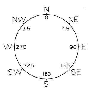
Forecasting Wind Speed
- Visit the Gfs-Lamp Text by State site.
- Click on the state you wish to forecast the hourly Wind Speed.
- To decode this information visit Description of the GFS LAMP Alphanumeric Message.
- The 4th line down on the left is WSP. This is the WIND SPEED for each hour of the day. This lists the forecasted WIND SPEED for each hour for the next 24 hours.
- Next line is WGS (Wind Gust Speed). If no significant wind gusts are expected, “NG” (No gusts) is indicated otherwise the speed of the forecast wind gusts are given in knots.
Forecast Cloud Cover for Every Hour of the Day
Download Instructions- Visit the Gfs-Lamp Text by State site.
- Next select the state for which you want to forecast and click on it.
- To decode this information visit Description of the GFS LAMP Alphanumeric Message.
- At the left is a column…second line down is UTC (Universal Time). A complete time chart is available to all for all time zones in the United States.
The 15th line DOWN ON THE LEFT is CLD. This is the cloud or sky cover for each hour of the day. This lists the forecasted cloud cover for each hour for the next 24 hours. See decoding below: Pretty simple.
- Cl = clear (Sunny during the daytime)
- FW = a few clouds (Mostly sunny during daytime)
- SC = Scattered clouds, Partly sunny during daytime
- BK = Broken clouds (Mostly cloudy)
- OV = Overcast (Cloudy)
Forecast Precipitation Probability for Every Hour of the Day
Download Instructions- Visit the Gfs-Lamp Text by State site.
- Next select the state for which you want to forecast the hourly precipitation probability.
- To decode this information visit Description of the GFS LAMP Alphanumeric Message.
- At the left is a column…7th Line down is PPO Which stands for PRECIPITATION PROBABILITY. (CHANCES OF HAVING PRECIPITATION AT THAT HOUR) A complete time chart is available to all for all time zones in the United States.
This lists the forecasted PROBABILITY OF PRECIPITATION for each hour for the next 24 hours.
This is how it is decoded: It simply lists the chance of precipitation at that hour in percentages, the higher the number, the better the chance of having precipitation.
Forecast the Precipitation Type for Every Hour of the Day
Download Instructions- Visit the Gfs-Lamp Text by State site.
- Next select the state for which you want to forecast the hourly precipitation type.
- To decode this information visit Description of the GFS LAMP Alphanumeric Message.
- The 14TH line DOWN ON THE LEFT is TYPE. This is the Type of Precipitation expected for each hour of the day. This lists the forecasted Precipitation type for each hour for the next 24 hours.
This is how it is decoded:
- S = Pure snow or snow grains
- Z = Freezing rain/drizzle, ice pellets or anything mixed with freezing precipitation
- R = Pure rain or rain mixed with snow
- X = Forecast is missing for this hour
Forecast Chance of Thunderstorms for Any Hour of the Day
Download Instructions- Visit the Gfs-Lamp Text by State site.
- Next select the state for which you want to forecast the hourly thunderstorm chances.
- To decode this information visit Description of the GFS LAMP Alphanumeric Message.
- At the left is a column, 10th Line down is TP2 which stands for THUNDERSTORM PROBABILITY. (CHANCES OF HAVING THUNDERSTORMS DURING THE 2 HOUR PERIOD ENDING AT THE INDICATED TIME). A complete time chart is available to all for all time zones in the United States.
This lists the forecast PROBABILITY OF THUNDERSTORMS for each hour for the next 24 hours.
This is how it is decoded: It lists the chance of THUNDERSTORMS at that hour in percentages, the higher the number, better the chance of having THUNDERSTORMS.
Using Radar to Forecast Weather
Download InstructionsOne of the most important instruments used to forecast weather is radar. Signals are sent out and bounce off precipitation and return to the radar site. From this, you will be able to tell how far away the precipitation is; how intense it is; as well as the speed and direction of the precipitation. Let’s take a look at some radar sites available and see which one you would like to use during upcoming storms.
- Let's try this radar site first. Visit Penn State Meteorology.
- If you want the precipitation to move, click on ( SHOW ANIMATION LOOP) at the very top of the radar map. If the entire United States is not showing, go to the top near Show Animation” and hit UNITED STATES.
- If you want to “zero in” on a particular part of the United States, simply click on REGIONAL VIEW at the very top of the page OR CLICK ON ANY SECTION OF THE MAP.
- Try PAN & ZOOM. You might like it!
- During the cold weather season, RAIN shows up as GREEN. Moderate rain shows up as Yellow while heavy rain is indicated as orange or red. FREEZING RAIN OR ICE PELLETS show up as a PINK color while SNOW appears WHITE. As a result of these different colors on this radar display, it is possible to see where it is raining, how hard, where the rain is turning to sleet and freezing rain and where it is remaining all snow. This is very important when making a forecast.
Give them an assignment for home. See if they can find some precipitation on the map. Where was it and in which direction was it moving? Is it rain, snow or sleet and/or freezing rain? Is it light rain, moderate rain or heavy rain? Have each student introduce the radar to his/her parents. Have them explain to the parents how it works. It could be very important if some day severe weather is approaching. It could save lives!
Using Satellites to Forecast the Weather
Download Instructions- Visit GOES-East - Latest CONUS Images and click on one of the images.
- This is a very large satellite image. Using your mouse, move the satellite picture by sliding the bottom and side bars.
- See if you can locate your part of the country.
- Are there any clouds over your area?
- If there are no clouds over your area, locate the closest clouds.
- Are you able to put the satellite in motion?
- Visit GOES Image Viewer and click a region.
- This map helps you see which way the clouds and precipitation are moving.
- If the clouds and precipitation are not in motion, look to the section at the extreme lower left, just below the satellite map itself. Find WEATHER IN MOTION and click on it!
Using the Surface Weather Map to Help Forecast Weather
Download Instructions- Visit the Weather Underground's Current Surface Weather map.
- This is the latest surface map. Print this map each day and hang it on the wall. My students used to like to color in the map. (To get earlier maps is a little difficult).
- DO YOU SEE AN “H”? The “H” stands for a high-pressure system. (Blue)
- DO YOU SEE AN “L”? The “L” stands for a low-pressure system. (Red)
- Do you see black solid lines? These lines are isobars. An isobar is a line, on a weather map, connecting places that have the same pressure, at the same time.
Using the NAM Surface Computer Model
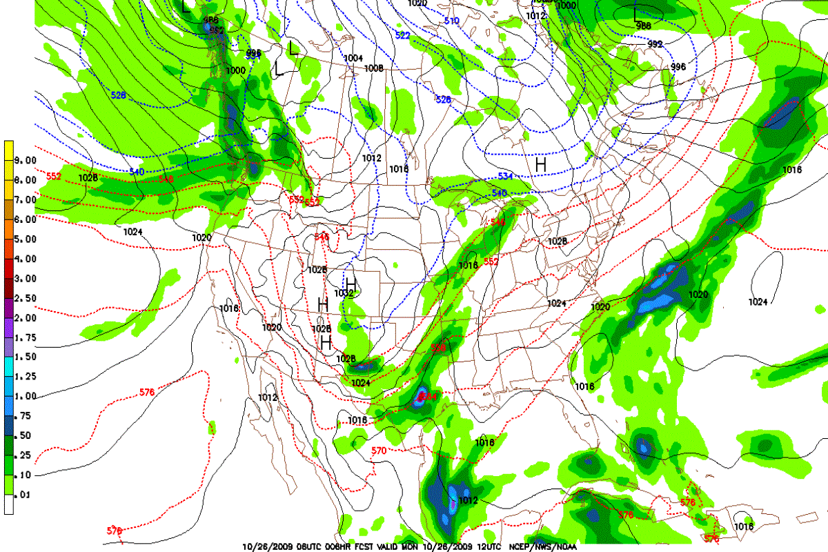
How do I read the map above and what does it all mean? First of all, this is a computer SURFACE model forecasting future weather. In this case, it is forecasting the weather 6 hours in advance. The forecast is valid 10/26/2009 at 12 UTC. How do we know this?
At the bottom of the map see:
10/26/09 06 UTC 006 HR FCST VALID 10/26/09 12 UTC NCEP/NWS/NOAA. This is what the numbers mean.
- 10/26/09 06UTC = the date and time the map was produced.
- 006 HR FCST = This indicates how many hours out the forecast is valid. (6 Hours)
- VALID = Thu 10/26/09 12 UTC. This map is valid for 10/26/2009 at 12 UTC.
- NCEP, NEW, NOAA = list the branches of the government responsible for the forecasts.
PRECIPITATION: The first thing that pops out are the green areas. Once such area is approaching Western Canada, while another is located in the central part of the United States. You notice there are different shades of green. LIGHTER GREENS indicate light precipitation. The DARKER GREENS indicate heavier precipitation. BLUE indicates very heavy precipitation. Look to the left side of the map. There you will find a scale indicating the intensity of the precipitation. ***This scale indicates how many inches of precipitation will have fallen by the time the map is valid. In other words, the dark blue on the map indicates between .50 and .75 inches of precipitation will already be in the rain gauge by the time 10/28/09 18 UTC occurs.
ISOBARS: Isobars are lines on a weather map, connecting all areas that have the same air pressure at the same time. In the center of the United States see an “L” surrounded by dark, solid lines. These are isobars. They are labeled every 4 millibars. (1000,1004,1008 etc.) The lowest pressure reading is located in the center of the low pressure area.
WIND: When the isobars are packed close together, the winds are strong. Notice the closed isobar (1024) over the northeastern part of the United States. Although this not indicated with an “H”, it is a center of a High Pressure system. Notice there is no precipitation in the center of the High. Winds are also nearly calm. There is no isobar packing. There is also a large high pressure system well off the California coast in the Pacific Ocean. (1028 mb.) Do you see it?
THICKNESS LINES: Look carefully. You will see dashed lines (both red and blue). These lines are good indicators of the temperature of the atmosphere. Generally the RED dashed lines indicate warm weather while the dashed BLUE lines indicate cold weather. Notice these lines have numbers such as 546, 552, 558, 564 etc. in the western section of Texas. The higher the number, the warmer the weather.
You will notice a large high pressure area in north central Canada. (1032 millibars) Do you see the dashed blue lines labeled 528, 534 etc.? These dashed lines indicate cold weather. The lower the number, the colder the weather.
SNOW VERSUS RAIN: The dashed lines on the map help us predict the type of precipitation we can expect. (Rain, snow or mixed precipitation) Generally the 540-dashed line when it passes through areas of precipitation on the map separates rain from snow. Numbers lower than 540, such as 534 would indicate frozen precipitation or snow while numbers above 540, such as 546 would indicate melted precipitation or rain. Right along the 540-dashed line expect a mixture of very wet snow and rain or even ice pellets called sleet.
Now Let’s Go to Real Time Weather Forecasting
- Visit the National Weather Service Model Analyses and Guidance website.
- Go to left hand column labeled “NAM. Select time. Use latest time possible. See time chart provided. 06Z UTC (Universal time) = 1 AM Eastern Standard Time (EST) during the winter season, and 2AM Eastern Daylight Times during the summer season. Usually 06Z is available for use by approximately 7 or 8 AM. (EST)
- Click on “FINE”.
- Go down to “4 Panel Charts”. (hours). Here you have many choices. Let’s select the second column from the right (MSLP-1000-500MB).
- SURFACE WEATHER FORECASTS
- Click 000-018. The four panel map that appears is A) the initial state of the atmosphere. It is not a forecast but the actual condition of the atmosphere that existed at the time of observation.
- Next is a 6 hour forecast from the initial time.
- Next is a 12 hour forecast from the initial time.
- The 4th panel is an 18 hour forecast from the initial time.
- Now click on the 024-042.
- The first panel is a 24 hour forecast from the initial panel.
What Do You Do When the Maps Comes into View?
- Can you find an “H”. That is a High Pressure area. High pressure usually means fair weather.
- Can you find an “L”. That is a Low Pressure Area. Low pressure usually means storms and precipitation.
- Can you find a light green area? (Light green usually means an area where some light precipitation is expected to fall. Look to the extreme left side of the chart to see how much precipitation is expected to fall in a 6 hour period ending at the time of this map. (In other words, by the time indicated on this map, (last 6 hours) the precipitation has already hit the ground.
- Can you find a darker green area? (Dark green usually means an area where some heavier precipitation can be expected. (See left side of chart to indicate how much precipitation is expected. Notice if you see “Red Areas” of precipitation it means 4-5 inches of melted precipitation can be expected to hit the ground during the previous six hours.
- Can you find “Dotted Lines(…….)? Notice some are Red and some are Blue. The “first” blue line is labeled “540”. The higher this number goes, the warmer the weather will be in that area. If the 540 line “cuts through a precipitation area (green) it many time divides snow areas from rain areas. The value 540 and below (colder) normally indicates precipitation in the form of snow. For example, a value of 546 generally indicates rain. A value of 534 usually indicates snow.
- Can you find solid black lines? These solid black lines on a weather map are called isobars. They are lines on a weather map that connect places that have the same air pressure at the same level of the atmosphere at the same time. These lines are placed around HIGH and LOW pressure areas and are always spaced 4 MB. apart. For example, here are the isobars drawn on a weather map. 1000 mb, 1004 mb, 1008 mb. 1012 mb, 1016 mb, 1020 mb, 1024 mb. 1028 mb, 1032 mb, 1036 mb. 1040 mb, 1044 mb. Around LOW pressure areas usually find the following isobars. 1000 mb, 996 mb, 992 mb, 988 mb. 984 mb, 980 mb, 976 mb, 972 mb, 968 mb, 964 mb, 960 mb.
- On a weather map (Around a station model) air pressure would be recorded as follows: 1000.0 mb. = 000, 1004.0 mb. = 040. (Cross off the “10” and remove the decimal point. 1008.0= 080, 1012.0= 120, 1016.0=160, 1020.0=200, 1024.0=240, 1028.0=280, 1032.0=320, 1036.0=360, 1040.0=400, 1044.0=440.
- Around low pressure areas: 1000.0=000, 996.0=960, 992.0=920, 988.0=880, 984.0=840, 980.0=800, 976.0=760. (Cross off the first 9 and eliminate the decimal point)
- Do you see any black lines (isobars) packed close together? When isobars are “packed” it indicates STRONG WINDS. The closer they are packed, the stronger are the winds.
- From the first set of maps, you now have an indication if the weather will be: a) dry or wet. (green areas) b) If the precipitation will be in the form of rain or snow (look for green areas and the location of the …..(dotted lines) Below 540 = snow, above 540 = rain. c) You will know whether it will be cold or warm. (By looking at the dashed lines….The higher the number, the warmer the weather. D) You will know whether it will be windy or not windy. (Packed isobars).
- You will also be able to forecast the direction of the winds from these maps. After you read the chapter on winds, surface wind direction and resulting weather will become quite clear.
- From the “NAM” YOU WILL BE ABLE TO FORECAST THE WEATHER OUT 84 HOURS FOR YOUR AREA OR ANY AREA IN NORTH AMERICA.. TRY IT! It takes a little practice.
Using the NAM 500 MB Upper Air Computer Model

How do I read the map above and what does it all mean? First of all, this is a computer 500 MB. model forecasting future weather. In this case, it is forecasting the weather 12 hours in advance. The forecast is valid 10/26/2009 at 18 UTC. How do we know this?
At the bottom of the map see:
10/26/09 06 UTC 012 HR FCST VALID 10/26/09 18 UTC NCEP/NWS/NOAA. This is what the numbers mean.
- 10/26/09 06UTC = the date and time the map was produced.
- 012 HR FCST = This indicates how many hours out the forecast is valid. (6 Hours)
- VALID = Thu 10/26/09 18 UTC. This map is valid for 10/26/2009 at 18 UTC.
- NCEP, NEW, NOAA = list the branches of the government responsible for the forecasts.
WHAT DO WE SEE? It looks like there is a “mountain” off the West Coast of the United States and another “mountain off the East Coast. We call these mountains, RIDGES. They are pockets of warm air. In the central part of the United States there appears to be a deep valley. We call these valleys in the upper air, TROUGHS. These are pockets of cold air.
WINDS: Winds on this map are indicated by a “shaft” which points into the direction from whence the wind comes. On the shaft, find lines and flags. A line represents a wind speed of 10 knots. One half line represents a wind speed of 5 knots. A flag represents a speed of 50 knots. For example, the upper level winds to the right of the “valley or trough” are blowing from the south or slightly southwest. The winds along the west coast are coming from the north. Notice the winds in the center of the troughs and ridges are very light and variable, meaning they can come from any direction.
SURFACE STORM MOVEMENT: Storms and precipitation (we call this weather) are carried by these upper air winds. We call these winds the “steering winds”. Weather on the surface moves “with” the winds at about one half the speed of the 500-millibar winds. For example, if the 500 millibar winds are blowing from the south at a speed of 80 knots, the storm and the accompanying precipitation will move towards the north at a speed of 40 knots. (VERY IMPORTANT)
VORTICITY: Notice the yellow and red coloring on the map? This indicates vorticity. Vorticity is a spi8nning, upward motion of air. Vorticity supports the intensification (strengthening or deepening) of storms. Yellow is moderate vorticity while red is strong vorticity. The brighter the red, the stronger the vorticity and the greater will be the intensification of the storm.
Now Let’s Go to Real Time Weather Forecasting
MODEL ANALYSIS AND FORECASTS (UPPER AIR) 500 MB (18,000 FT)
- Visit the National Weather Service Model Analyses and Guidance website.
- CHOOSE MODEL-NAM
- SELECT UPPER AIR PARAM.- 500_rh_ht
- CHOOSE FORECAST HOUR - 000
- CLICK ON THE "NEXT" BUTTON, THE MAP WILL ADVANCE 3 HOURS, CLICK NEXT AGAIN, THE MAP WILL ADVANCE ANOTHER 3 HOURS.
- DO YOU SEE SOLID BLACK LINES? They are “height lines”. Oddly enough, they actually indicate the temperature of the atmosphere. The lower the number, the colder the air at 18,000 feet. For example, a reading of 570 over an area indicates it is much warmer than an area that has 540 over it.
- DO YOU SEE WIND BARBS? These barbs indicate the wind speed and the direction from which the wind is blowing.
- The flag indicates 50 knots, while each line represents 10 knots. A half flag equals 5 knots. If there were one flag and two lines, it would indicate a speed of 70 knots.( 50 knots for the flag and 20 knots for the two lines. (See wind chapter for further details).
- Storm systems on the surface would move at a speed of 35 knots (1/2 the speed of the 500 mb. Winds. If the winds were from the west, the storm would be moving towards the east being pushed by the westerly winds.
DO YOU SEE RED OR YELLOW AREAS? These areas indicate VORTICITY. (Vorticity is actually a spinning motion and supports the development of storms. Storms become much stronger & more severe when areas of vorticity approach them. Red areas of vorticity are stronger than yellow areas and thus would cause a storm to deepen much more rapidly. When vorticity is increasing, it is called Positive Vorticity Advection. (PVA)
Using the NAM 700 MB Upper Air Computer Model

How do I read the map above and what does it all mean? First of all, this is a computer 700 MB. model forecasting future weather. In this case, it is forecasting the weather 84 hours in advance. The forecast is valid 10/29/2009 at 18 UTC. How do we know this?
At the bottom of the map see:
10/26/09 06 UTC 084 HR FCST VALID 10/29/09 18 UTC NCEP/NWS/NOAA. This is what the numbers mean.
- 10/26/09 06UTC = the date and time the map was produced.
- 084 HR FCST = This indicates how many hours out the forecast is valid. (84 Hours)
- VALID = Thu 10/29/09 18 UTC. This map is valid for 10/29/2009 at 18 UTC.
- NCEP, NEW, NOAA = list the branches of the government responsible for the forecasts.
The 700 MB. Map represents a level in the atmosphere of about 10,000 ft. above sea level.
WHAT DO WE SEE? It looks very much like the 500 MB. Map with the ridges off the west coast and over the southeastern part of the United States. It shows the numbered solid lines that were present on the 500 MB. Map. Notice, however, THE SHADES OF GREEN on the map. The green represents the relative humidity (moisture) in the atmosphere. LIGHT GREEN indicates a relative humidity of 70% whereas the darker green color represents a relative humidity of 90%. A relative humidity of 70% generally indicates cloudy weather with a few rain or snow showers depending on the season. It could also indicate some steady light or very light precipitation. A relative humidity of 90% generally indicates cloudy weather with a steady area pf precipitation, which possibly could be heavy. Precipitation generally begins when the 700 MB. Map indicates the relative humidity is increasing from 70% to 90%. This, of course, is a very general rule.
HOW MUCH MOISTURE IS PRESENT IN THE UPPER AIR? (700 MB. MAP (10,000 FT.)
Now Let’s Go to Real Time Weather Forecasting
MODEL ANALYSIS AND FORECASTS (UPPER AIR) 500 MB (18,000 FT)
- Visit the National Weather Service Model Analyses and Guidance website.
- CHOOSE MODEL-NAM
- SELECT UPPER AIR PARAM.- 700_rh_ht
- CHOOSE FORECAST HOUR - 000
- CLICK ON THE "NEXT" BUTTON, THE MAP WILL ADVANCE 3 HOURS, CLICK NEXT AGAIN, THE MAP WILL ADVANCE ANOTHER 3 HOURS.
- Go back to the original page. (Model Analysis & Forecasts) NAM
- HOW MUCH MOISTURE IS IN THE AIR? If you want to see how much moisture is in the air, go to the 4th column from the left (700 mb. RH, Ht) The 700 mb. map is approximately at a height of 10,000 feet.
- Once again do you see the solid lines? (height lines) and wind barbs?
Do you see 2 shades of green? The light shade of green indicates a relative humidity of 70%. Generally an area with 70% indicates mostly cloudy skies with the chance of a few showers. The areas with dark green indicate a relative humidity of 90%. Generally, an area with 90% indicates cloudy skies with precipitation. (rain or snow). *precipitation usually begins when your location is at 70% increasing to 90%. (relative humidity about 80%).
Using the GFS Surface Computer Model
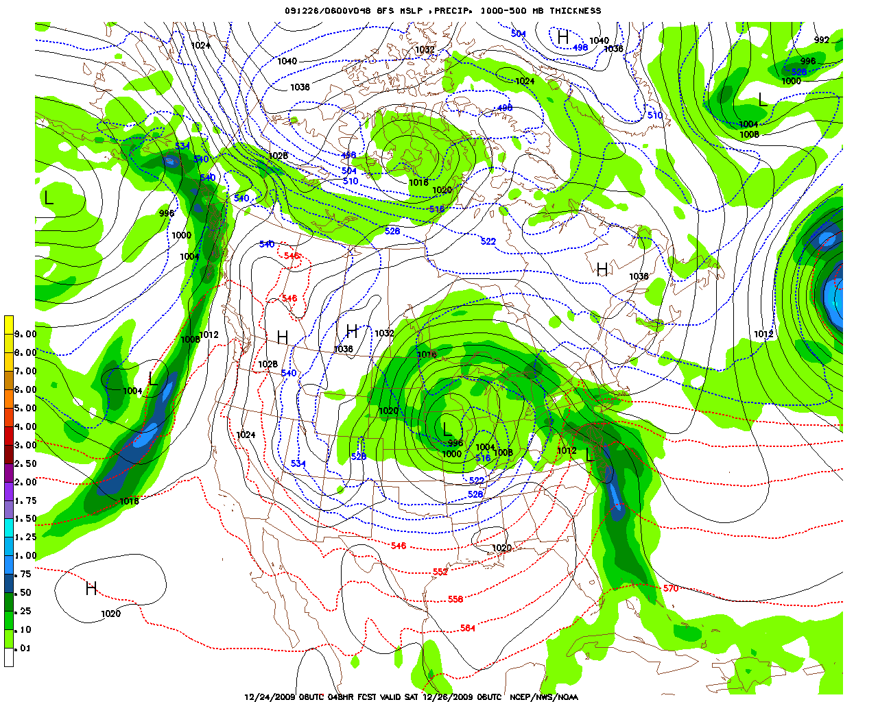
How do I read the above map and what does it all mean? First of all, this is a computer surface model forecasting future weather. In this case, it is forecasting the surface weather map 48 hours in advance. The forecasts is valid Saturday, 12/26/2009 at 06 UTC. How do we know this?
At the bottom of the map see:
12/24/2009UTC 048 HR FCST VALID SAT 12/26/2009 06 UTC NCEP/NWS/NOAA. This is what the numbers mean.
- 12/24/2009 06 UTC = the date and time the map was produced.
- 048 HR FCST = This indicates how many hours out the forecast is valid. (48 Hours)
- VALID = Sat 12/26/2009 at 06 UTC. This map is valid Saturday, 12/26/2009 at 06 UTC.
- NCEP, NEW, NOAA = list the branches of the government responsible for the forecasts.
PRECIPITATION: The first thing that pops out are the green areas. Once such area is approaching Western Canada, while another is located in the central part of the United States. Another green area is along the east coast. You notice there are different shades of green. LIGHTER GREENS indicate light precipitation. The DARKER GREENS indicate heavier precipitation. BLUE indicates very heavy precipitation. Look to the left side of the map. There you will find a scale indicating the intensity of the precipitation. ***This scale indicates how many inches of precipitation will have fallen by the time the map is valid. In other words, the dark blue on the map indicates between .50 and .75 inches of precipitation will already be in the rain gauge by the time 12/26/2009 at 06 UTC occurs.
ISOBARS: Isobars are lines on a weather map, connecting all areas that have the same air pressure at the same time. In the center of the United States see an “L” surrounded by dark, solid lines. These are isobars. They are labeled every 4 millibars. (1000,1004,1008 etc.) The lowest pressure reading is located in the center of the low-pressure area.
WIND: When the isobars are packed close together, the winds are strong. Notice the closed isobar (1036) over the northeastern part of Canada. This is indicated with an “H”, it is a center of the High Pressure system. Notice there is no precipitation in the center of the High. Winds are also nearly calm. There is no isobar packing. The isobars are packed around the low-pressure system in the center of the United States and thus you can expect strong winds around the storm center.
THICKNESS LINES: Look carefully. You will see dashed lines (both red and blue). These lines are good indicators of the temperature of the atmosphere. Generally the RED dashed lines indicate warm weather while the dashed BLUE lines indicate cold weather. Notice these lines have numbers such as 546, 552, 558, 564 etc. in Texas and points south into the Gulf of Mexico. The higher the number, the warmer the weather.
You will notice a large high-pressure area near Montana. (1036 millibars) Do you see the dashed blue lines labeled 540, 534, 528 etc.? These dashed lines indicate cold weather. The lower the number, the colder the weather. Cold weather is in Southern Illinois.
SNOW VERSUS RAIN: The dashed lines on the map help us predict the type of precipitation we can expect. (Rain, snow or mixed precipitation) Generally the 540-dashed line when it passes through areas of precipitation on the map separates rain from snow. Numbers lower than 540, such as 534 would indicate frozen precipitation or snow while numbers above 540, such as 546 would indicate melted precipitation or rain. Right along the 540-dashed line expect a mixture of very wet snow and rain or even ice pellets called sleet. Snow is forecast to fall through much of the mid-west and northern plains according to this GFS forecast map.
Now Let’s Go to Real Time Weather Forecasting
MODEL ANALYSIS AND FORECASTS (SURFACE)
- Visit the National Weather Service Model Analyses and Guidance website.
- CHOOSE MODEL - GFS
- SELECT UPPER AIR PARAM.- 700_rh_ht
- CHOOSE FORECAST HOUR - 000
- CLICK ON THE "NEXT" BUTTON, THE MAP WILL ADVANCE 3 HOURS, CLICK NEXT AGAIN, THE MAP WILL ADVANCE ANOTHER 3 HOURS.
What do you do when the maps comes into view?
- Can you find an “H”? That is a High Pressure area. High pressure usually means fair weather.
- Can you find an “L”? That is a Low Pressure Area. Low pressure usually means storms and precipitation.
- Can you find a light green area? (Light green usually means an area where some light precipitation is expected to fall. Look to the extreme left side of the chart to see how much precipitation is expected to fall in a 6 hour period ending at the time of this map. (In other words, by the time indicated on this map, (last 6 hours) the precipitation has already hit the ground.
- Can you find a darker green area? (Dark green usually means an area where some heavier precipitation can be expected. (See left side of chart to indicate how much precipitation is expected. Notice if you see “Red Areas” of precipitation it means 4-5 inches of melted precipitation can be expected to hit the ground during the previous six hours.
- Can you find “Dotted Lines(…….)? Notice some are Red and some are Blue. The “first” blue line is labeled “540”. The higher this number goes, the warmer the weather will be in that area. If the 540 line “cuts through a precipitation area (green) it many time divides snow areas from rain areas. The value 540 and below (colder) normally indicates precipitation in the form of snow. rain is still in green, but the new GFS indicates snow in BLUE For example, a value of 546 generally indicates rain. A value of 534 usually indicates snow.
- Can you find solid black lines? These solid black lines on a weather map are called isobars. They are lines on a weather map that connect places that have the same air pressure at the same level of the atmosphere at the same time. These lines are placed around HIGH and LOW-pressure areas and are always spaced 4 MB. apart. For example, here are the isobars drawn on a weather map. 1000 mb, 1004 mb, 1008 mb. 1012 mb, 1016 mb, 1020 mb, 1024 mb. 1028 mb, 1032 mb, 1036 mb. 1040 mb, 1044 mb. Around LOW pressure areas usually find the following isobars. 1000 mb, 996 mb, 992 mb, 988 mb. 984 mb, 980 mb, 976 mb, 972 mb, 968 mb, 964 mb, 960 mb.
- On a weather map (Around a station model) air pressure would be recorded as follows:1000.0 mb. = 000, 1004.0 mb. = 040. (Cross off the “10” and remove the decimal point. 1008.0= 080, 1012.0= 120, 1016.0=160, 1020.0=200, 1024.0=240, 1028.0=280, 1032.0=320, 1036.0=360, 1040.0=400, 1044.0=440.
- Around low-pressure areas: 1000.0=000, 996.0=960, 992.0=920, 988.0=880, 984.0=840, 980.0=800, 976.0=760. (Cross off the first 9 and eliminate the decimal point)
- Do you see any black lines (isobars) packed close together? When isobars are “packed” it indicates STRONG WINDS. The closer they are packed, the stronger are the winds.
- From the first set of maps, you now have an indication if the weather will be: a) dry or wet. (green areas) b) If the precipitation will be in the form of rain or snow (look for green areas and the location of the …..(dotted lines) Below 540 = snow, above 540 = rain. c) You will know whether it will be cold or warm. (By looking at the dashed lines….The higher the number, the warmer the weather. D) You will know whether it will be windy or not windy. (Packed isobars).
- You will also be able to forecast the direction of the winds from these maps. After you read the chapter on winds, surface wind direction and resulting weather will become quite clear.
- From the “GFS” YOU WILL BE ABLE TO FORECAST THE WEATHER OUT 384 HOURS FOR YOUR AREA OR ANY AREA IN NORTH AMERICA. TRY IT! All the rules given to read the NAM apply to the GFS. The NAM , however, is sometimes more accurate for short term forecasts. (Next day). However, it is best to look at both the NAM and the GFS when making a forecast.
Using the GFS 500 MB Upper Air Computer Model
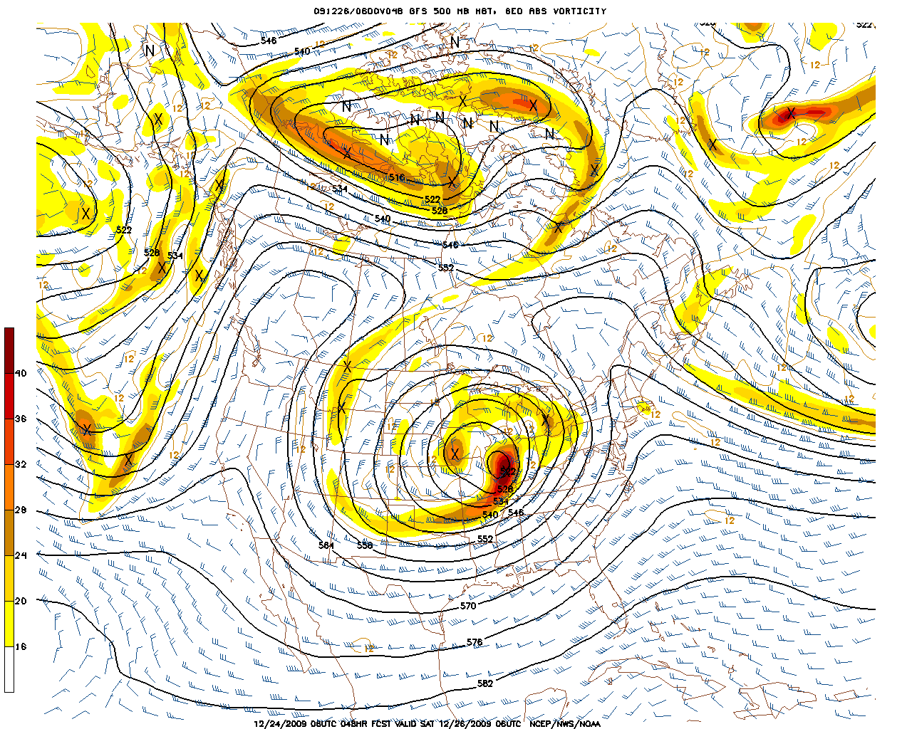
At the bottom of the map see:
12/24/2009 06UTC 048HR FCST VALID SAT 12/26/2009 06 UTC NCEP/NWS/NOAA
- 12/24/2009 06 UTC = the date and time the map was produced.
- 048 HR FCST = This indicates how many hours out the forecast is valid. (48 Hours)
- VALID = Sat 12/26/2009 at 06 UTC. This map is valid Saturday, 12/26/2009 at 06 UTC.
- NCEP, NEW, NOAA = list the branches of the government responsible for the forecasts.
WHAT DO WE SEE? It looks like there is a “mountain” along the West coast of the United States and another “mountain off the East Coast. We call these mountains, “RIDGES”. They are pockets of warm air. In the central part of the United States there appears to be a deep valley in fact, it is deep “cut off low”. We call these valleys or deep lows in the upper air, “TROUGHS”. Find another trough off the west coast of the United States. These troughs are pockets of cold air.
WINDS: Winds on this map are indicated by a “shaft” which points into the direction from whence the wind comes. On the shaft, find lines and flags. A line represents a wind speed of 10 knots. One half line represents a wind speed of 5 knots. A flag represents a speed of 50 knots. For example, the upper level winds to the right of the “valley or trough” are blowing from the south or slightly southwest. The winds along the west coast are coming from the north. Notice the winds in the center of the troughs and ridges are very light and variable, meaning they can come from any direction.
SURFACE STORM MOVEMENT: Storms and precipitation (we call this weather) are carried by these upper air winds. We call these winds the “steering winds”. Weather on the surface moves “with” the winds at about one half the speed of the 500-millibar winds. For example, if the 500 millibar winds are blowing from the south at a speed of 80 knots, the storm and the accompanying precipitation will move towards the north at a speed of 40 knots. (VERY IMPORTANT)
VORTICITY: Notice the yellow and red coloring on the map? This indicates vorticity. Vorticity is a spinning, upward motion of air. Vorticity supports the intensification (strengthening or deepening) of storms. Yellow is moderate vorticity while red is strong vorticity. The brighter the red, the stronger the vorticity and the greater will be the intensification of the storm. See the very strong vorticity area near the Chicago area.
Now Let’s Go to Real Time Weather Forecasting
MODEL ANALYSIS AND FORECASTS (UPPER AIR) 500 MB (18,000 FT)
- Visit the National Weather Service Model Analyses and Guidance website.
- CHOOSE MODEL - GFS
- SELECT UPPER AIR PARAM.- 500_vort_ht
- CHOOSE FORECAST HOUR - 000
- CLICK ON THE "NEXT" BUTTON, THE MAP WILL ADVANCE 3 HOURS, CLICK NEXT AGAIN, THE MAP WILL ADVANCE ANOTHER 3 HOURS.
What do you do when the maps comes into view?
- Which way will storms move and at what speed?
- Do you see solid black lines? They are “height lines”. Oddly enough, they actually indicate the temperature of the atmosphere. The lower the number, the colder the air at 18,000 feet. For example, a reading of 570 over an area indicates it is much warmer than an area that has 540 over it.
- Do you see wind barbs? These barbs indicate the wind speed and the direction from which the wind is blowing.
- The flag indicates 50 knots, while each line represents 10 knots. A half flag equals 5 knots. If there were one flag and two lines, it would indicate a speed of 70 knots.( 50 knots for the flag and 20 knots for the two lines. (see wind chapter for further details). Storm systems on the surface would move at a speed of 35 knots (1/2 the speed of the 500 mb. Winds. If the winds were from the west, the storm would be moving towards the east being pushed by the westerly winds.
- Do you see red or yellow areas? These areas indicate vorticity. (vorticity is actually a spinning motion and supports the development of storms. Storms become much stronger & more severe when areas of vorticity approach them. Red areas of vorticity are stronger than yellow areas and thus would cause a storm to deepen much more rapidly. When vorticity is increasing, it is called positive vorticity advection. (PVA)
- From the “GFS” You will be able to forecast the weather out 384 hours for your area or any area in North America. Try it! All the rules given to read the NAM apply to the GFS. The NAM , however, is sometimes more accurate for short term forecasts. (Next day). However, it is best to look at both the NAM and the GFS when making a forecast.
Using the GFS 700 MB Upper Air Computer Model
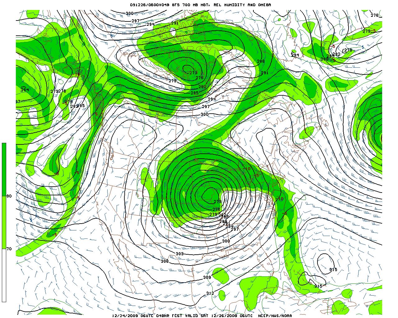
How do I read the map above and what does it all mean? First of all, this is a computer 700 MB.model forecasting future weather. In this case, it is forecasting the weather 48 hours in advance. The forecast is valid 12/26/2009 at 06UTC. How do we know this?
At the bottom of the map see:
12/24/09 06 UTC 048 HR FCST VALID 12/26/09 06 UTC NCEP/NWS/NOAA. This is what the numbers mean.
- 12/24/2009 06 UTC = the date and time the map was produced.
- 048 HR FCST = This indicates how many hours out the forecast is valid. (48 Hours)
- VALID = Sat 12/26/2009 at 06 UTC. This map is valid Saturday, 12/26/2009 at 06 UTC.
- NCEP, NEW, NOAA = list the branches of the government responsible for the forecasts.
The 700 MB. Map represents a level in the atmosphere of about 10,000 ft. above sea level.
WHAT DO WE SEE? It looks very much like the 500 MB. Map with the ridges along the west coast and just off the eastern part of the United States. It shows the numbered solid lines that were present on the 500 MB. Map. Notice, however, THE SHADES OF GREEN on the map. The green represents the relative humidity (moisture) in the atmosphere. LIGHT GREEN indicates a relative humidity of 70% whereas the darker green color represents a relative humidity of 90%. A relative humidity of 70% generally indicates cloudy weather with a few rain or snow showers depending on the season. It could also indicate some steady light or very light precipitation. A relative humidity of 90% generally indicates cloudy weather with a steady area of precipitation, which possibly could be heavy. Precipitation generally begins when the 700 MB. Map indicates the relative humidity is increasing from 70% to 90%. This, of course, is a very general rule.
Now Let’s Go to Real Time Weather Forecasting
How much moisture is present in the upper air? (700 MB Map (10,000 ft.)
- Visit the National Weather Service Model Analyses and Guidance website.
- CHOOSE MODEL - GFS
- SELECT UPPER AIR PARAM.- 700_rh_ht
- CHOOSE FORECAST HOUR - 000
- CLICK ON THE "NEXT" BUTTON, THE MAP WILL ADVANCE 3 HOURS, CLICK NEXT AGAIN, THE MAP WILL ADVANCE ANOTHER 3 HOURS.
- HOW MUCH MOISTURE IS IN THE AIR? If you want to see how much moisture is in the air, go to the 8th column from the left (700 mb. RH, Ht) The 700 mb. map is approximately at a height of 10,000 feet. Times are listed on the left (000-018) etc.
- Once again do you see the solid lines? (height lines) and wind barbs? The tighter the lines are packed, the stronger the winds.
- Do you see 2 shades of green? The light shade of green indicates a relative humidity of 70%. Generally an area with 70% indicates mostly cloudy skies with the chance of a few showers. The areas with dark green indicate a relative humidity of 90%. Generally, an area with 90% indicates cloudy skies with precipitation. (rain or snow). *precipitation usually begins when your location is at 70% increasing to 90%. (relative humidity about 80%).
- From the “GFS” you will be able to forecast the weather out 384 hours for your area or any area in north america. Try it! All the rules given to read the nam apply to the GFS. The NAM, however, is sometimes more accurate for short term forecasts (next day). However, it is best to look at both the NAM and the GFS when making a forecast